October 28, 2025
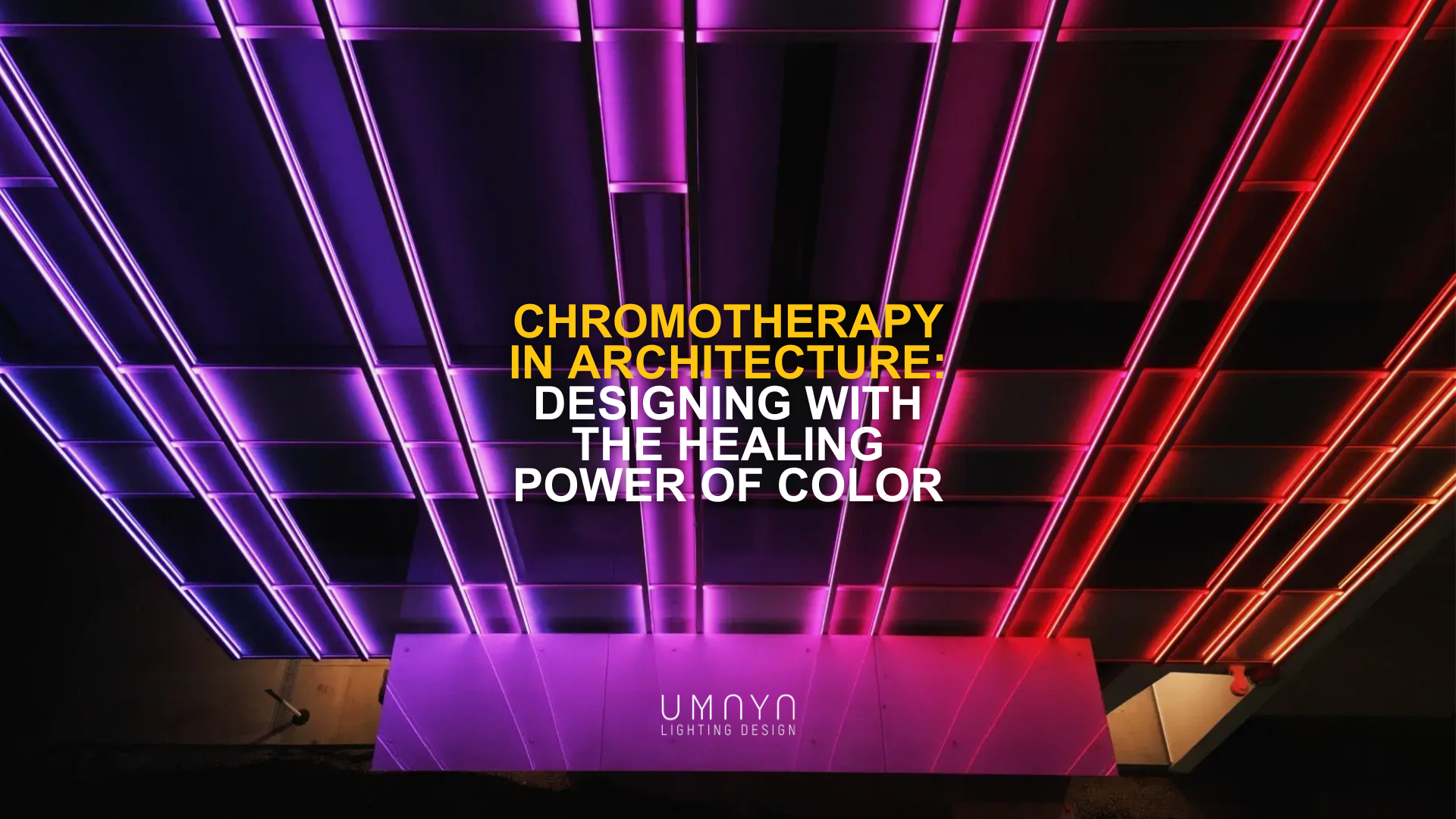
Chromotherapy in Architecture: Designing with the Healing Power of Color
Architecture has always shaped more than space. It shapes our state of mind, our energy, even our physiology. Chromotherapy (color therapy) traces back thousands of years to Egyptian temples and Persian medicine, where sunlight and colored surfaces were used to accelerate healing. Today, as evidence from neuroscience and environmental psychology confirms, color and light remain powerful variables in design. For us as lighting designers, the question is not whether color affects us, but how we engineer it with precision and intention.
The Science Behind Color and Heal
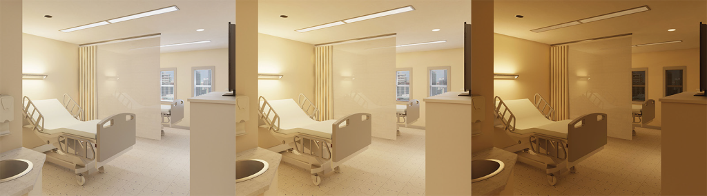
Colors are not neutral; they carry measurable physiological impact. Studies demonstrate that warm hues like red can stimulate the nervous system, raising heart rate and alertness, while cooler tones such as blue and green reduce anxiety and lower blood pressure. In hospitals, research has proven that “happy” color combinations in patient rooms reduce recovery times and psychosomatic stress. Traditional Persian medicine went even further, linking specific colors to the balance of human temperament, recommending green and blue for calming, yellow for energy, and black to be avoided in healing environments.
Chromotherapy in Architectural Practice
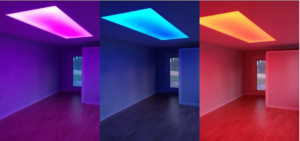
In contemporary architecture, color and light are often reduced to surface decoration or mood-setting. But chromotherapy reframes them as fundamental tools of spatial performance. Designing with color is designing with the body in mind. For example, a façade that shifts in gradient tones can transform a plaza into an energizing, social space. A hospitality interior bathed in warmer palettes can induce intimacy, while wellness environments call for balanced, softer tones that regulate circadian rhythms.
We see chromotherapy not as an abstract wellness trend, but as a technical and cultural discipline. It is where neuroscience meets material craft. Light and surface must be calibrated together, with attention to spectrum, reflectance, and context.
This philosophy guided our work for the Social Habilitation Centre in AlUla, where the lighting design was developed to support guests with physical, sensory, and mental impairments. Tunable white and color-changing systems followed users’ circadian rhythms, while fixtures with a UGR below 19 ensured visual comfort. In therapy and consulting rooms, color transitions: cool to warm, white to blue, were introduced as a form of chromotherapy to promote calm and emotional balance. Here, light became a personalized healing medium, proving that color can be engineered not just for beauty, but for wellbeing.